
Q1 2026
ScreenConnect
Focus indicator
MarketSquare
Designing trust for high-value peer-to-peer commerce
Q1 2024
Overview
The Situation
ScreenConnect is a highly customizable remote support and access platform for MSPs and IT professionals. They focus heavily on providing their users with custom options to make each user’s version of the product their own, but some key features get lost in the process, example WCAG compliance. Navigating through ScreenConnect’s product pages can be challenging because of the lack of WCAG consistency for all users including those who may face visual or mobility impairment.
My Role
As the product designer, my responsibility was to collaborate closely with product managers and engineers to translate how we could implement, design, and development a more impactful focus indicator for the product that is easier to notice, read, and most importantly meets WCAG standards.
Results
Bounce Rate reduced from 49% to 32%
Discovery
Understanding the Problem
Keyboard navigation of the product does not follow standard website content accessibility guidelines. This can translate into a serious issue for users who face visual or mobile impairment. When users currently navigate through the product using the keyboard the focus indicator that highlights what the user has selected is not always visible, dropdown trees open without selecting them, and using the tab key to navigate through sections jumps all over the page rather than following a consistent format when trying to navigate.
Define
The Challenge
ScreenConnect allows a high level of customization for users. This includes branding, background, and theme changes. We have to redesign the current focus indicator to be visible on all pages for all themes.
Understanding and Analyzing
Before diving into design I wanted to gather a firm understanding about our product. This required a look into past and current research.
The core challenge became defining trust as a measurable product problem. Verification signals were inconsistent, listing expectations unclear, and payment flows introduced anxiety at decisive moments. The team aligned around designing a system that communicated confidence continuously rather than relying on isolated safety features.


Market Research
Every year people lose about $3.3 billion using peer to peer marketplace platforms (2020). By 2025 that amount will rise by 11x to $33 billion.

Competitors
The top most used P2P marketplace apps commonly used today (depending on niche) are Ebay, Esty, FB marketplace and Amazon. Almost all of them use 3rd party payment transactions and have not yet adopted AI into their designs.
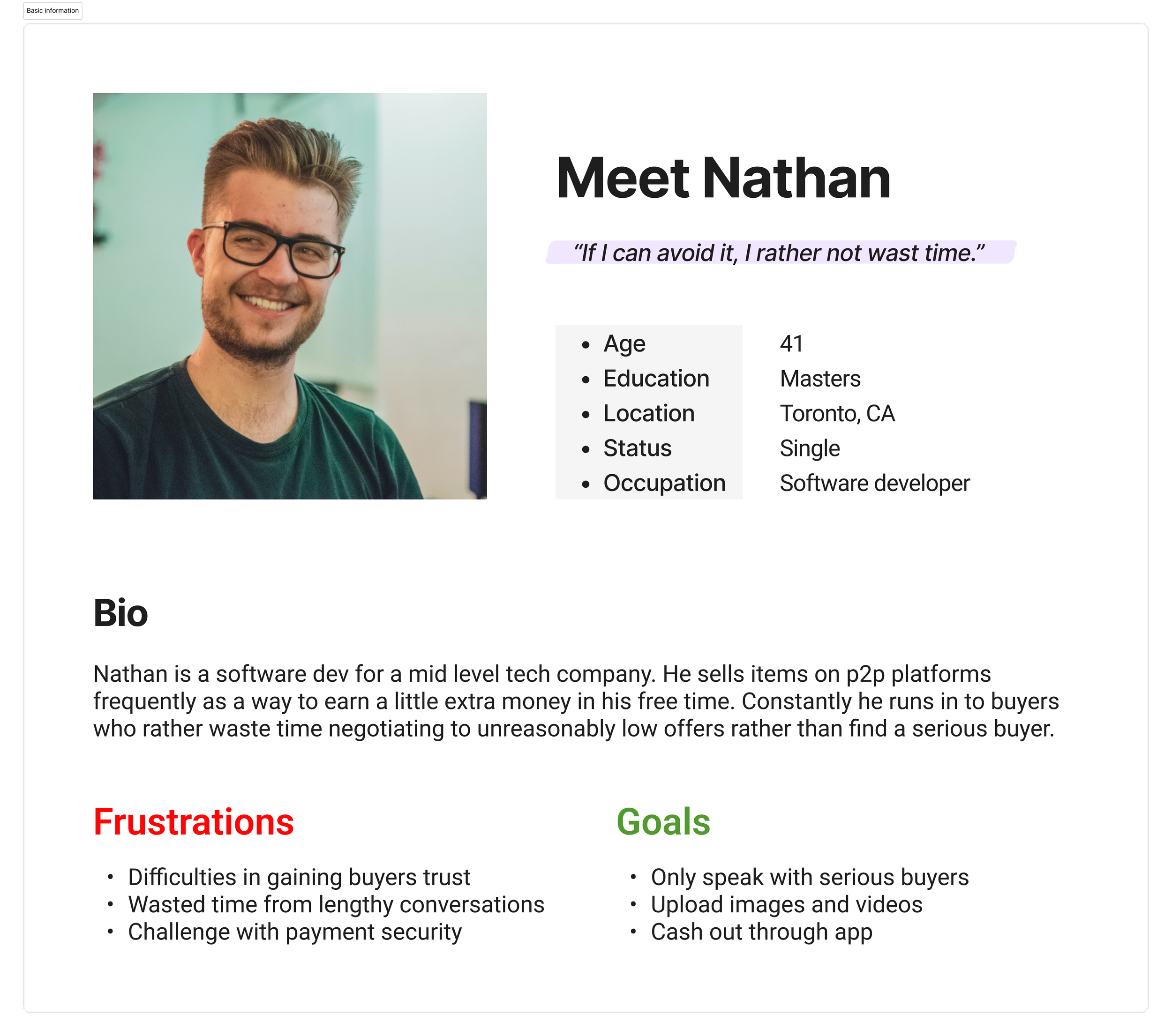
Users
To understand known pain points I reached out to the customer experience and docs team to gather information on users. I used that information to form user a journey map, empathy maps, and personas from both a buyer and seller point of view.


Design Audit
Before moving into solutions, I conducted a deeper audit of the existing product to clarify what should remain and what needed refinement in the V1 adaptation. This review revealed several opportunities:
Sellers were unable to edit list items after creation,
Filtering options needed to be expanded to better support search behavior.
Button and input field designs lacked consistency.
The information architecture required restructuring
The main user flow could be condensed to reduce friction.
With these insights, research findings, and personas in mind — I facilitated a collaborative brainstorming session, encouraging the team to generate a wide range of ideas without considering feasibility in order to unlock bold, high-impact solutions.
Ideate
Designing Trust As a System
Design exploration focused on how trust could be embedded across the entire marketplace journey rather than added as a standalone feature. Concepts explored progressive onboarding, earlier visibility of verification signals, transparent pricing communication, reassurance patterns during transactions, and AI implementation.
These explorations helped establish guiding principles centered on visibility, transparency, and intentional friction where confidence mattered most.
How might we mitigate scams and increase engagement between buyers and sellers?
How might we successfully include AI in the product’s design?

Use AI to generate description/category tags
Introduce and expand on pay to talk feature
Wallet
MVP Features:

Listing
Direct messaging
User Flow
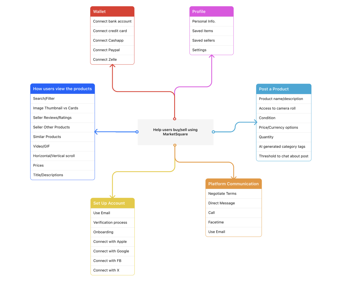
To understand how the product would function I recreated an end-to-end user flow to operationalize research insights into a scalable product structure. By mapping user intentions, system responses, and edge cases, the flow exposed complexity and trust breakdowns early, allowing cross-functional partners to align on experience logic before investing in UI execution.

Design
Designing Trust as a System (Continued)
Based on the data we accumulated I built out a design system, wireframes and 2 prototypes (light and dark modes) to showcase the new direction of both seller and buyer user flows.

WCAG Accessibilty & Brand Identity
Question for the stakeholder: What does the brand represent and what does it colors scheme say about it?
High value/Sophisticated
Luxury/Royalty
Clean/Elegance

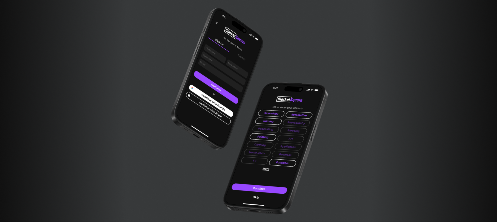
Bringing The Design to Life
Sign Up

Sign In

Onboarding

Search
Home


Product View (Buyer)

Listing an Item (Seller)

Wallet

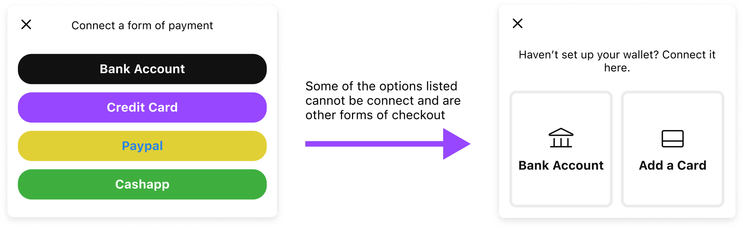
Tradeoffs
To ensure the UI maintained a visual identity that aligned with current design standards, we introduced targeted tradeoffs that balanced aesthetics with functionality. The idea was to maintain a modern feel and user flow that carefully evaluated against usability and product goals.

Additionally, working within a compressed timeline and limited engineering bandwidth required prioritizing foundational marketplace stability over feature expansion. Advanced personalization and seller analytics were intentionally deferred in favor of strengthening transaction confidence.
In several cases, deliberate friction was introduced instead of removed, prioritizing certainty over speed during high-risk interactions.
Results
What Changed and What Improved?
Throughout the course of this project the initial design and user flow were modified to improve user trust throughout the experience.
Outcomes (A/B Testing)
When testing the previous design against the redesign with 19 of the previous users, key analytics were discovered. Usability validation showed onboarding completion improving by 26%, while transaction drop-off decreased by 17%. Task success rates increased to 32%, and user trust perception scores improved by 100%. Listing activation increased by 79%.
As time progressed, I checked back with the analytics team and learned fraud-related support requests decreased by 18% after implementation.
Beyond individual metrics, the work established a scalable trust framework capable of supporting future marketplace growth.
Why Does This Matter to The Business?
With increased trust the amount of users interactions skyrocketed and also increased customer retention.
Takeways
Reflection
Designing with empathy in mind. Or to be more direct, focus on the people just as much as the numbers. Pushing product and being profitable is important, but making sure your users feel heard, and improving user trust is arguable just as impactful. MarketSquare reinforced that in two-sided marketplaces, trust is the primary product experience. Designing for high-value transactions requires balancing usability with confidence while aligning user behavior with marketplace health.
What I Learned
Trust the data. Combing through the prior research and doing my own help me gather a better understanding of the direction stakeholders wanted to take this project. Meeting those needs while also keeping the user first sometimes proved challenging, but was ultimately worth it in the end.
What I Would Do Next?
Although I’m no longer apart of the team, I’d recommend continuing to iterate on the flows. Some suggestion that come to mind would be the addition of MFA password protection for the wallet flow and adding new forms of payment.