
MarketSquare
Designing trust for high-value peer-to-peer commerce
Q1 2024
Overview
The Situation
Buying and selling high-value goods online introduces inherent risk. While peer-to-peer marketplaces provide accessibility and reach, they often struggle with fraud, unclear seller credibility, and transaction anxiety. MarketSquare aimed to create an environment where users felt confident completing meaningful transactions rather than hesitating at critical moments.
Early signals showed users abandoning onboarding and exiting transactions before payment completion. Trust wasn’t failing at a single interaction — it was breaking down across the entire experience.
My Role
As the product designer, I led the experience from discovery through delivery during an eight-week engagement. I partnered closely with product managers and engineers to translate marketplace risks into scalable design solutions across mobile and web platforms, owning research synthesis, interaction design, system definition, prototyping, and usability validation.
Discovery
Understanding the Problem
Through competitive analysis, journey mapping, and usability evaluation, a consistent behavioral pattern emerged: users were willing to accept additional steps when those steps increased confidence, but quickly abandoned flows when uncertainty appeared without explanation.
This reframed the problem. Speed was not the primary goal — reassurance was. Users needed clarity throughout the transaction lifecycle to feel safe completing high-value exchanges.
Define
The Challenge
Unlike traditional e-commerce platforms, P2P marketplaces must balance the needs of buyers and sellers while maintaining marketplace liquidity. Improvements that reduce friction for sellers can introduce risk for buyers, and vice versa.
The core challenge became defining trust as a measurable product problem. Verification signals were inconsistent, listing expectations unclear, and payment flows introduced anxiety at decisive moments. The team aligned around designing a system that communicated confidence continuously rather than relying on isolated safety features.
A look into the research.


Every year people lose about $3.3 billion using peer to peer marketplace platforms (2020). By 2025 that amount will rise by 11x to $33 billion.
The top most used P2P marketplace apps commonly used today (depending on niche) are Ebay, Esty, FB marketplace and Amazon. Almost all of them use 3rd party payment transactions and have not yet adopted AI into their designs.

EMPATHY MAPPING


PERSONAS
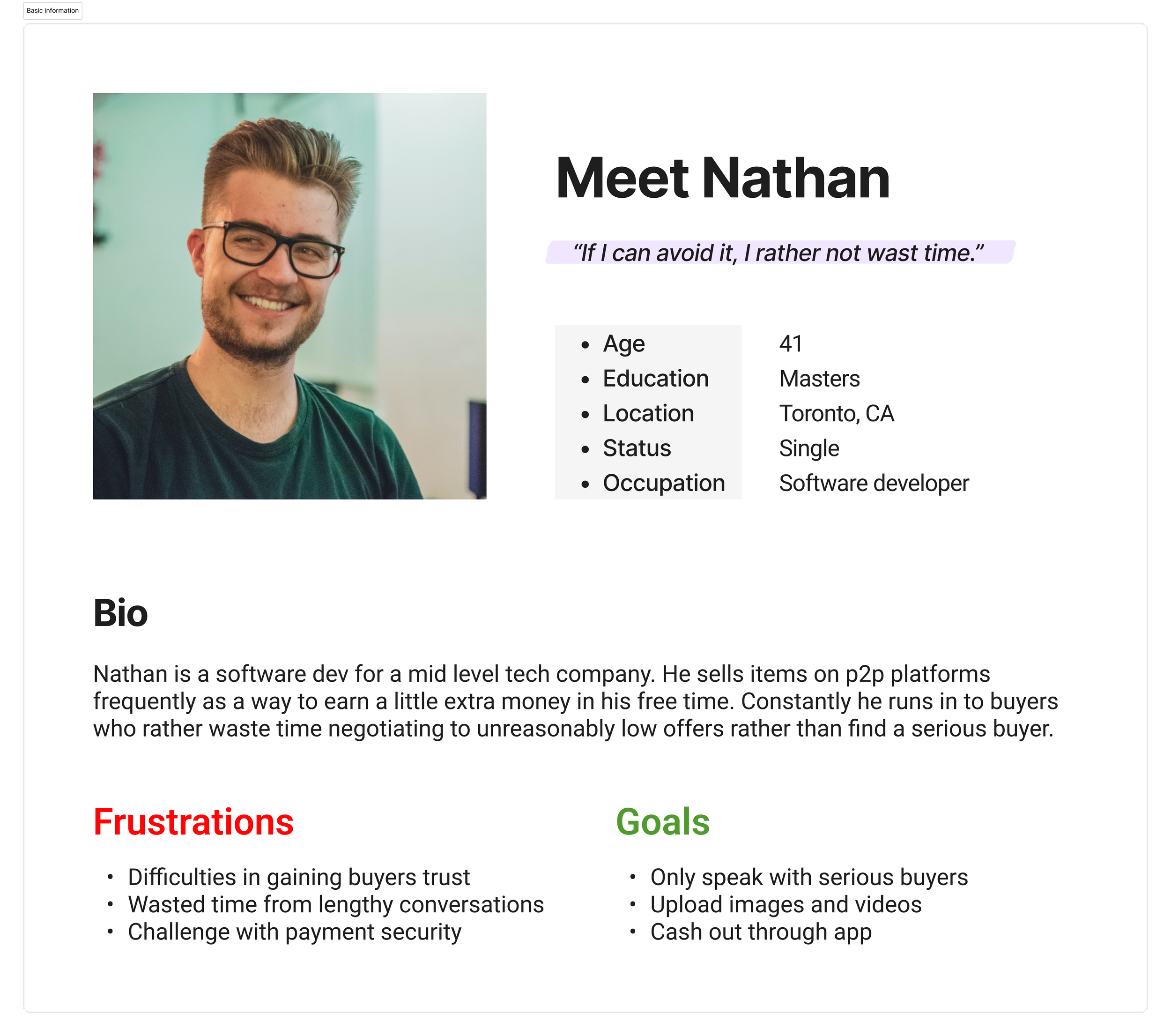
We were also provided information regarding users and able to craft 2 separate personas to represent the target audience. Buyer vs seller.

Ideate
Designing Trust As a System
Design exploration focused on how trust could be embedded across the entire marketplace journey rather than added as a standalone feature. Concepts explored progressive onboarding, earlier visibility of verification signals, transparent pricing communication, reassurance patterns during transactions, and AI implementation.
These explorations helped establish guiding principles centered on visibility, transparency, and intentional friction where confidence mattered most.
How might we mitigate scams and increase engagement between buyers and sellers?
How might we successfully include AI in the product’s design?

Use AI to generate description/category tags
Introduce and expand on pay to talk feature
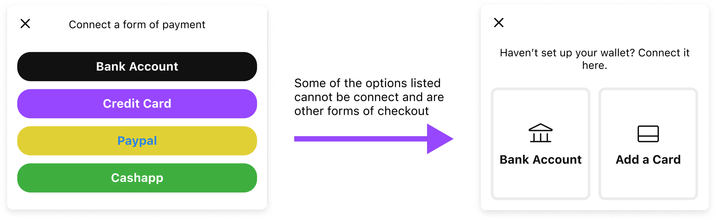
Wallet
MVP Features:

Listing
Direct messaging
User Flow
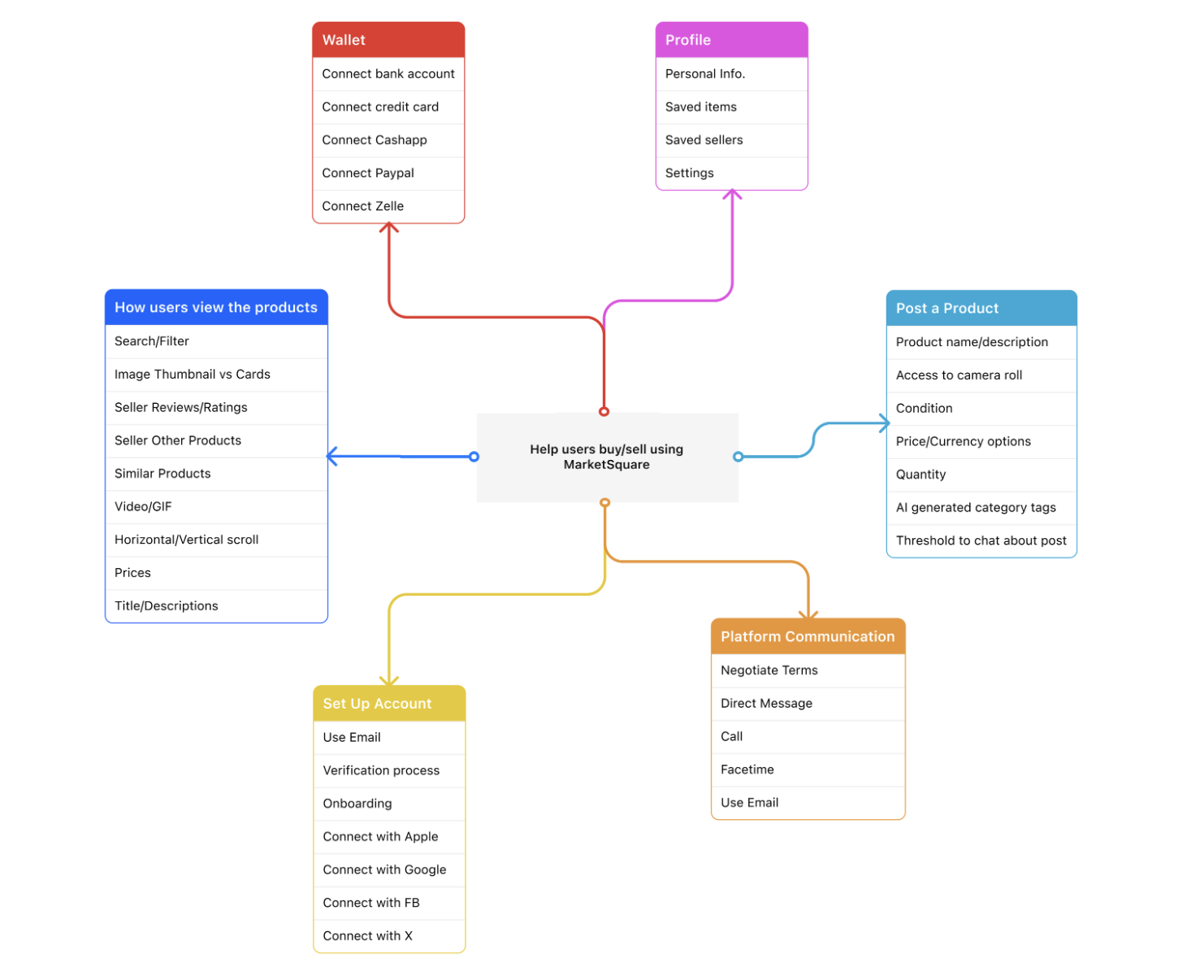
To understand how the product would function I created end-to-end user flow to operationalize research insights into a scalable product structure. By mapping user intentions, system responses, and edge cases, the flow exposed complexity and trust breakdowns early, allowing cross-functional partners to align on experience logic before investing in UI execution.

Design Audit
We took a deeper dive into the existing content to finalize structure and improvements. There we identified key features that what would and would not stay as part of the v1 adaption.
No edit option for list item (seller side)
Expand upon filtering search options
Inconsistent button and input field designs
Information architecture
Can condense main flow
With our research findings and personas in mind, I invited the team to brainstorm solutions for the app design together. I encouraged them to come up with as many ideas as possible without considering feasibility.
Design
Designing Trust as a System
Trust was implemented as infrastructure woven throughout onboarding, discovery, and transaction experiences.
Seller onboarding was redesigned using progressive disclosure to guide listing creation without overwhelming users. Verification indicators and product transparency were surfaced earlier to reduce buyer hesitation. Transaction flows were simplified while introducing clearer pricing breakdowns, confirmation states, and contextual reassurance during payment.
To support long-term scalability, I established a 140+ component design system that unified typography, hierarchy, and interaction patterns across platforms, reducing inconsistencies and accelerating collaboration between design and engineering.
To build the design system, we first had to determine what elements would translate well from web to mobile design. In order to do that we mapped out wireframes for what the app could potentially look like as well as created an additional prototype in Figma for user feedback.

WCAG Accessibilty & Brand Identity
Question for the stakeholder: What does the brand represent and what does it colors scheme say about it?
High value/Sophisticated
Luxury/Royalty
Clean/Elegance

Bringing The Design to Life
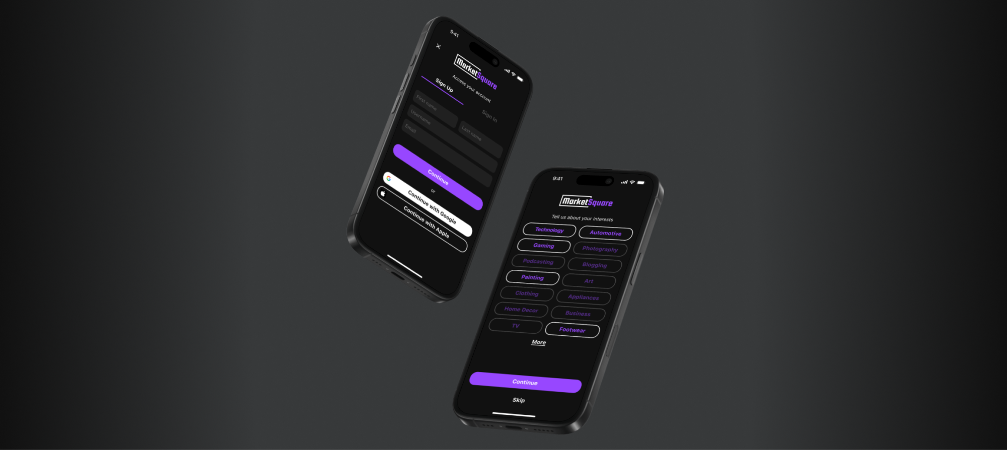
Sign Up

Sign In

Onboarding

Search
Home


Product View (Buyer)

Listing an Item (Seller)

Wallet

Tradeoffs
To ensure the UI maintained a visual identity that aligned with current design standards, we introduced targeted tradeoffs that balanced aesthetics with functionality. The idea was to maintain a modern feel and user flow that carefully evaluated against usability and product goals.

Additionally, working within a compressed timeline and limited engineering bandwidth required prioritizing foundational marketplace stability over feature expansion. Advanced personalization and seller analytics were intentionally deferred in favor of strengthening transaction confidence.
In several cases, deliberate friction was introduced instead of removed, prioritizing certainty over speed during high-risk interactions.
After finalizing all screens, I created my prototype in Figma to get a better feel of how the app will look and function.
Results
Outcomes (A/B Testing)
Usability validation showed onboarding completion improving by 24%, while transaction drop-off decreased by 10%. Task success rates increased to 32%, and user trust perception scores improved by 100%. Listing activation increased by 15%.
As time progressed, I checked back with the analytics team and learned fraud-related support requests decreased by 18% after implementation.
Beyond individual metrics, the work established a scalable trust framework capable of supporting future marketplace growth.
Takeways
Reflection
Designing with empathy in mind. Or to be more direct, focus on the people just as much as the numbers. Pushing product and being profitable is important, but making sure your users feel heard, and improving user trust is arguable just as impactful. MarketSquare reinforced that in two-sided marketplaces, trust is the primary product experience. Designing for high-value transactions requires balancing usability with confidence while aligning user behavior with marketplace health.