

PROJECT
MarketSquare App
TIMELINE
Q1 2024
ROLE
Lead UX/UI Designer
RESPONSIBILITIES
End-to-end UX/UI Design & Design System Creation
Overview
MarketSquare (company name under NDA) is a U.S. based fintech infrastructure for large, time-sensitive payments. They’re in the process of creating an IOS app version of their website that focuses on a two-sided marketplace system that facilitates high-value item peer-to-peer transactions between buyers and sellers.
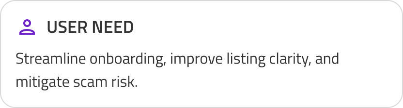
At the time of engagement, the product was functionally complete (web) and app development was still in concept. Core flows existed, but conversion was inconsistent. Users felt overwhelmed with information during onboarding which caused a 64.3% drop off before listing an item, sellers struggled with listing clarity which caused more friction, and buyer/seller matchmaking for item inquiries created user fear of scams, which contributed to high churn. More friction = low to zero product trust = no transaction confidence.
There were multiple areas to address all at once. The Goal was to:
Reduce user friction and cognitive load during onboarding.
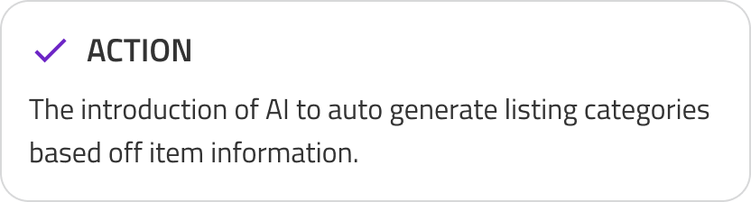
Introduce AI and determine how it can be used to improve item listing clarity.
Reduce churn and increase user trust in overall product.
Kickoff
We held kick off and a team introduction to align everyone on the project’s goals, scope, research needs, and timeline. Immediately after, I co-facilitated a workshop to identify user pain points and potential opportunities to simplify the current journey or reshape it altogether. Here we identified our challenges, user needs, business needs, and framed the core problem.
The Challenge
Unlike traditional e-commerce platforms, P2P marketplaces must balance the needs of buyers and sellers while maintaining marketplace liquidity. Improvements that can reduce friction for sellers can also introduce risk for buyers, and vice versa. We have to keep this in mind while addressing both business and user needs.

To meet the needs of both business and users I turned our goals into a problem statement.
The Problem: How might we mitigate scam risk, streamline onboarding, introduce AI, and provide more in app clarity all in one go?

Gathering Insights
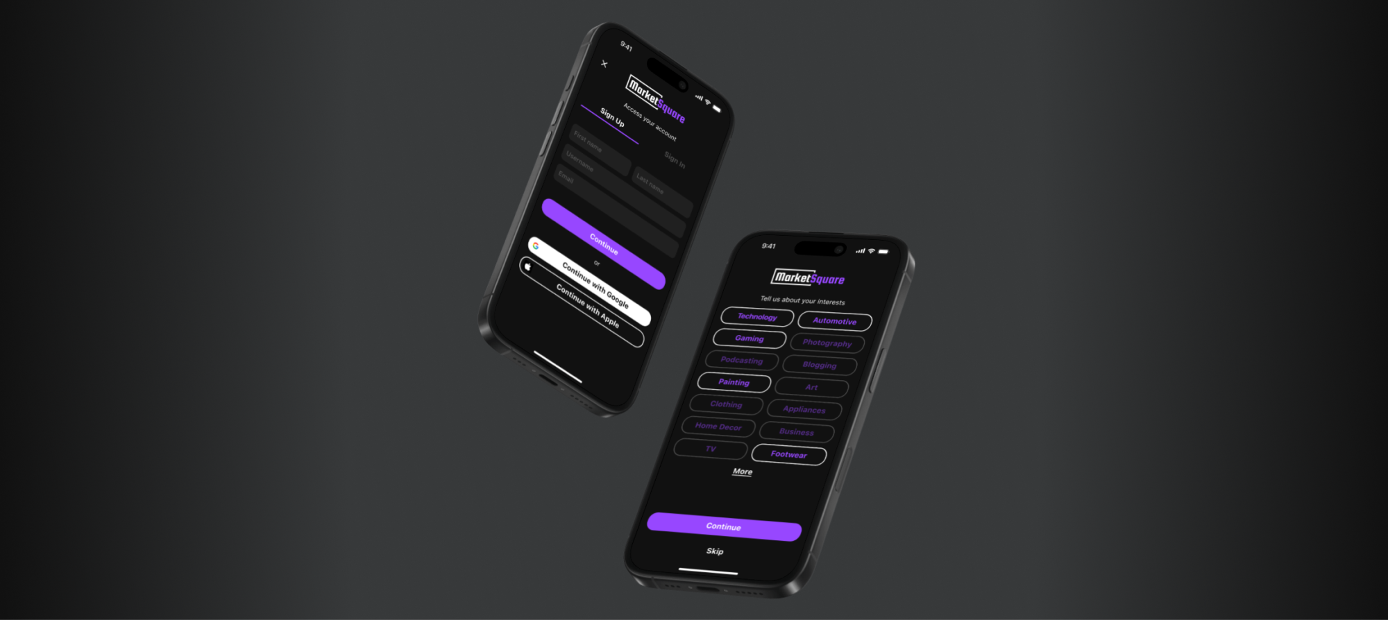
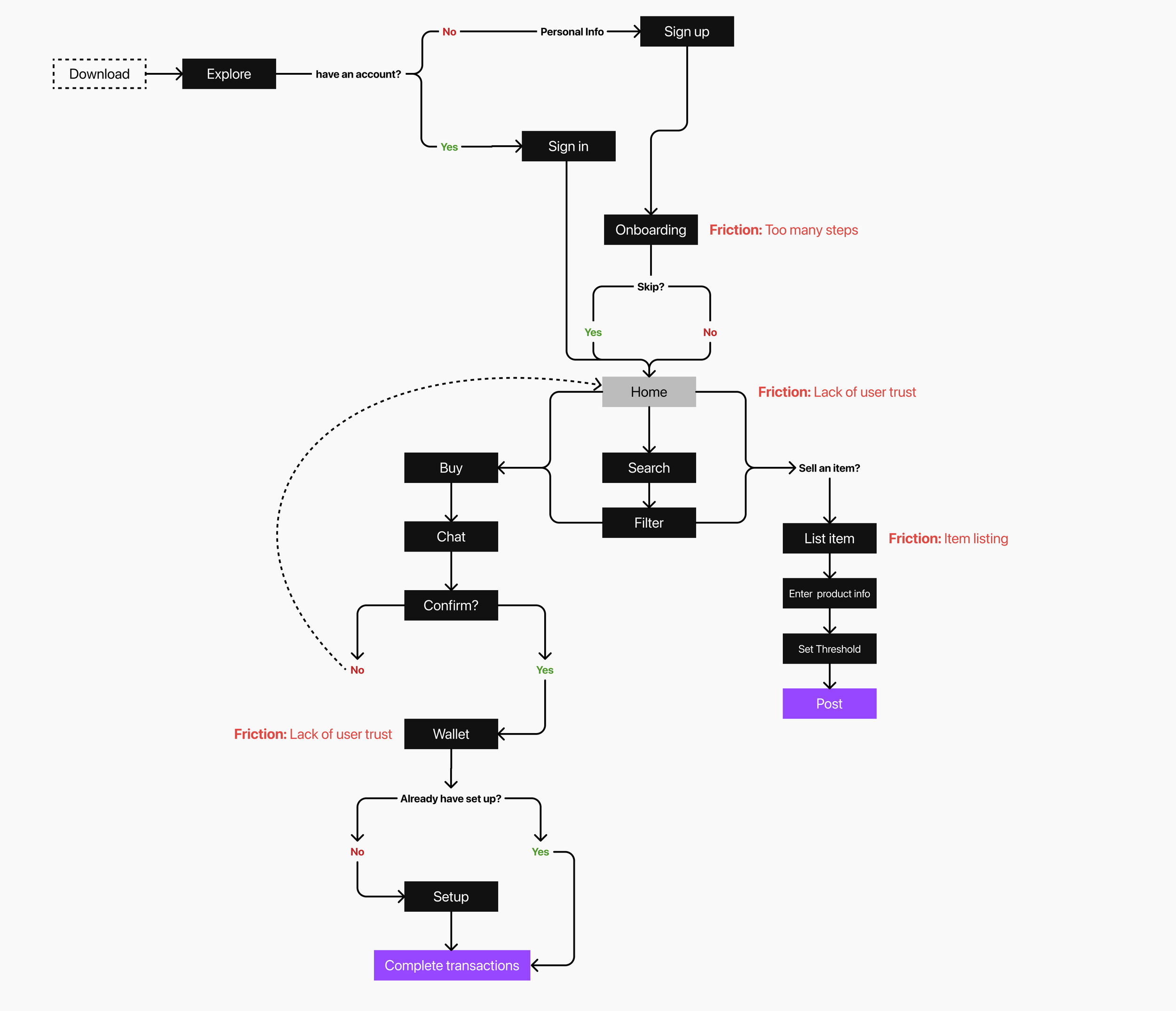
To understand product’s flow and business direction I took a look at past and present research. User research revealed what we already knew, that users face fatigue in 3 key areas within the user flow: onboarding, listing an item, and user trust.
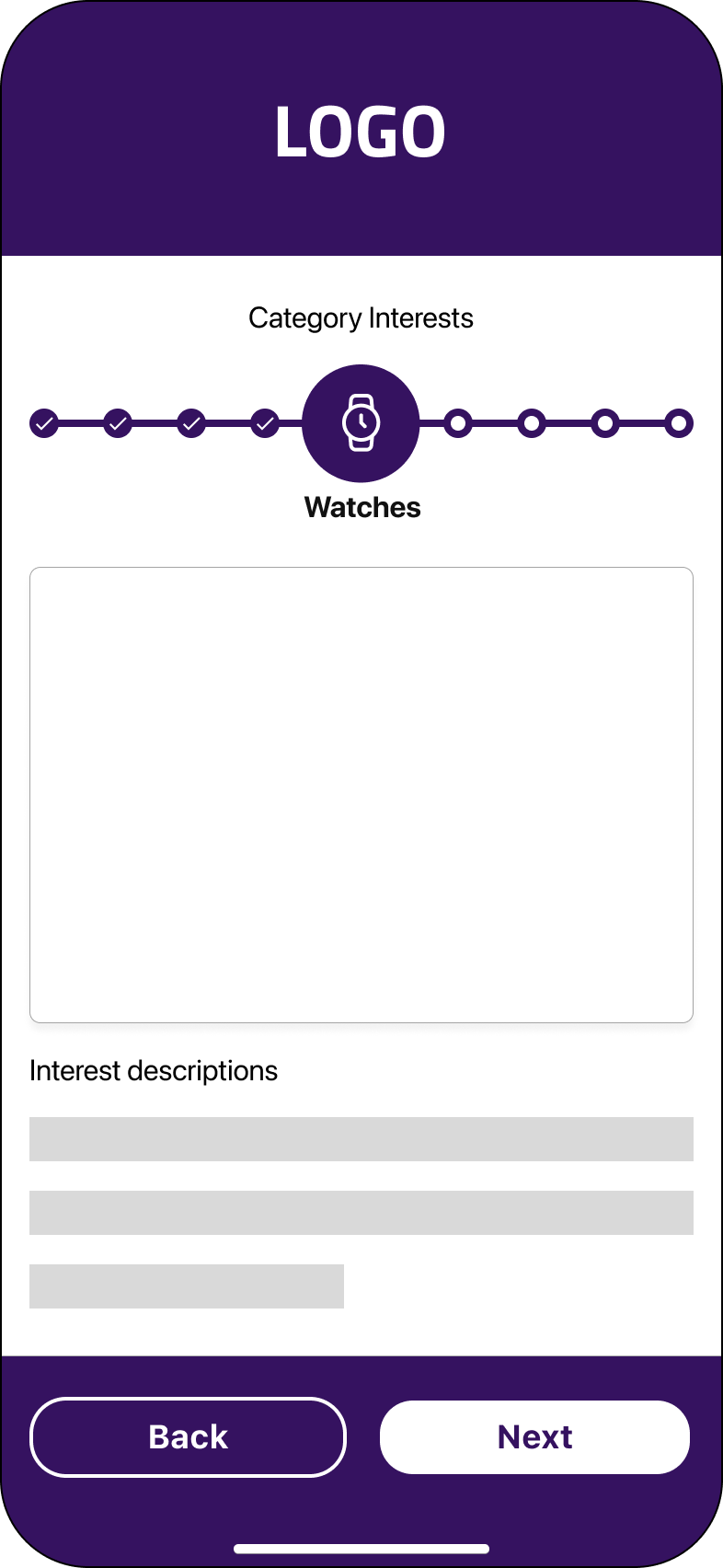
Onboarding: Too many steps, with each interest category requiring a separate screen
Listing flow: Sellers could not edit listings after posting
Trust: Users hesitated to share personal and financial information
To better understand the experience, I redesigned the user flow to highlight friction points and trust breakdowns.
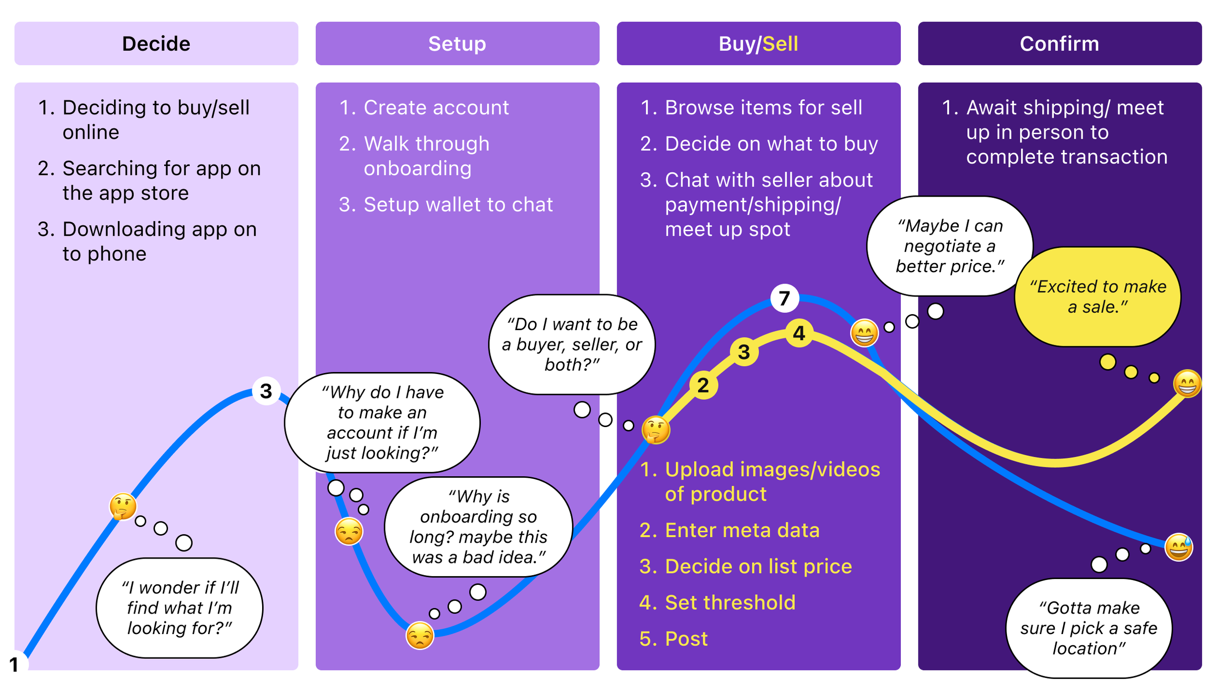
Also, I created a journey map based on user data to define user pain points and the expected experience for individuals acting as either buyers or sellers.
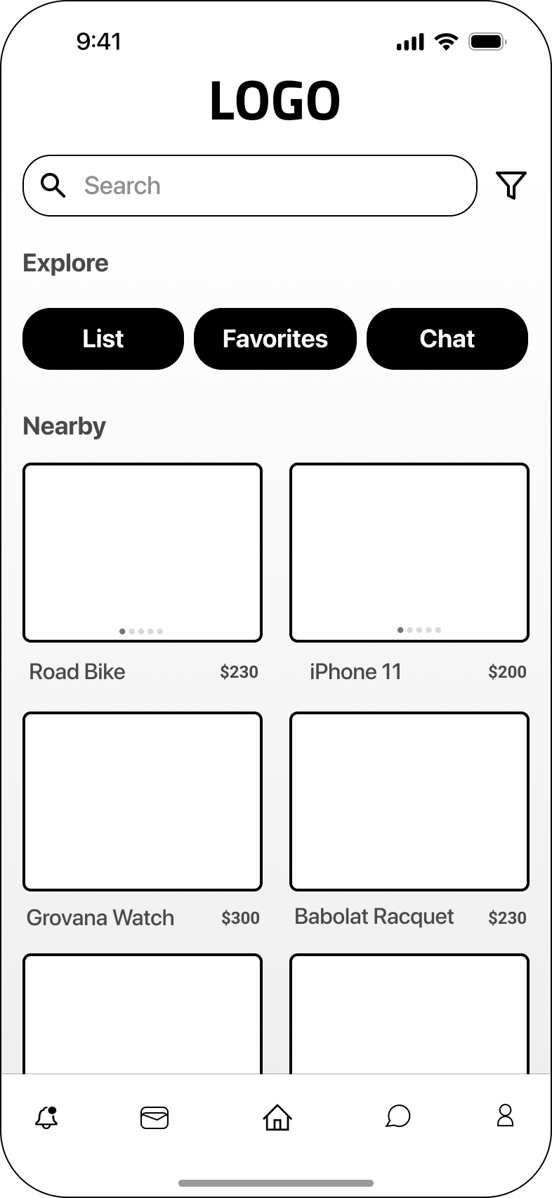
Iterations
To meet tight deadlines we focused on rapid iteration starting with a mix of Lo-FI wireframes and moved into Hi-FI designs as decisions were made. Collaborating with product and dev we identified key areas for refinement.
Pervious Iterations
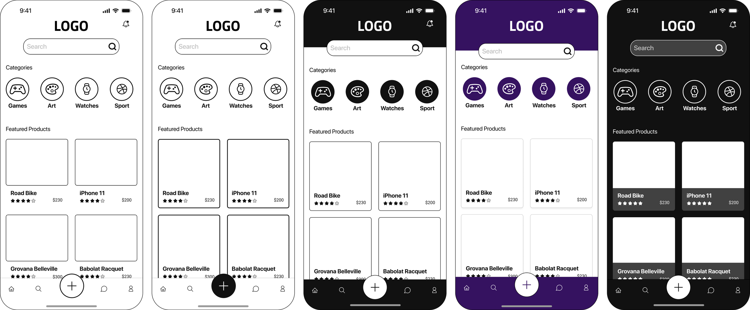
Iteration 2
Iteration 1
Iteration 3
Design Tradeoffs
Early on key stakeholders made it clear that they wanted 2 things a defined dock (bottom row of icons) with a matching header and a homepage design that automatically played looping videos to showcased product. Similar to Instagram’s explore page. The idea was to set the app apart from the competition.
However, after some convincing I was able to navigate the direction of the design to a “less is more approach.” I suggested a light and dark them instead of the two-toned concept. Also, I reminded the team that were are trying to reduce cognitive load. Adding more moving parts may end up doing more harm than good.
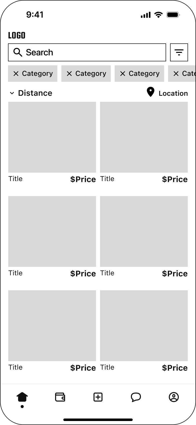
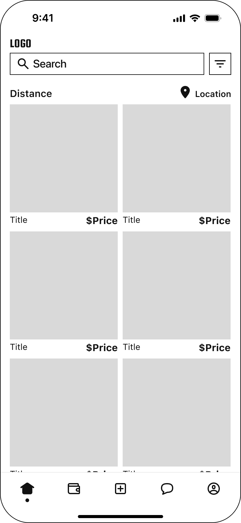
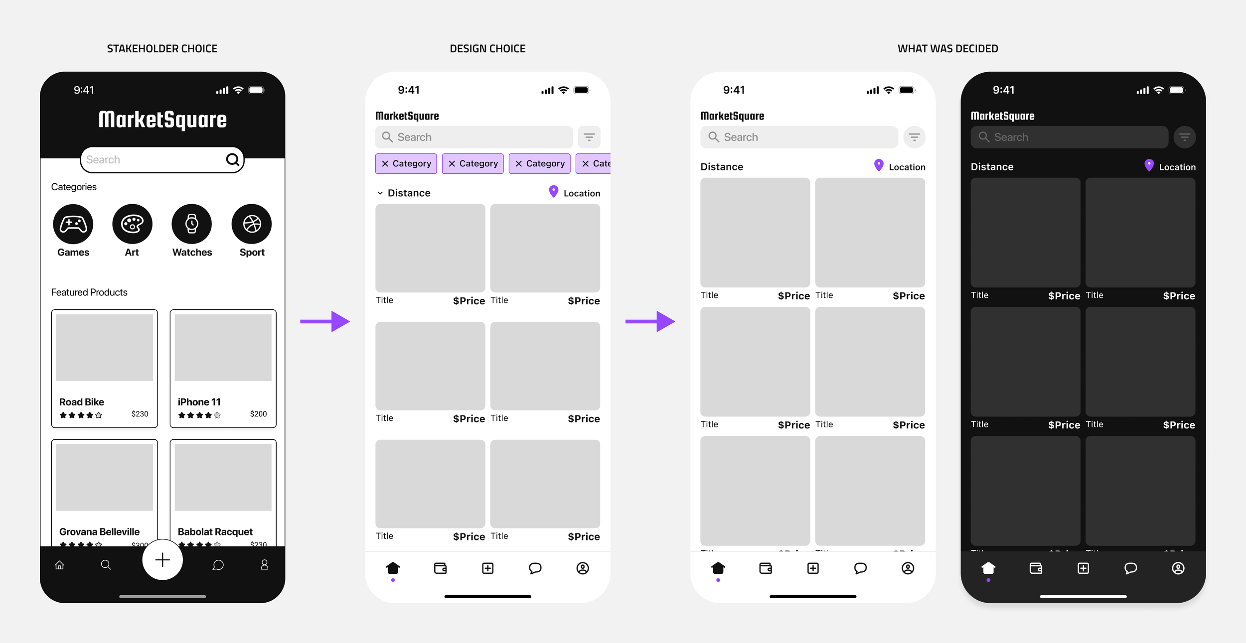
Iteration 2 vs Iteration 3
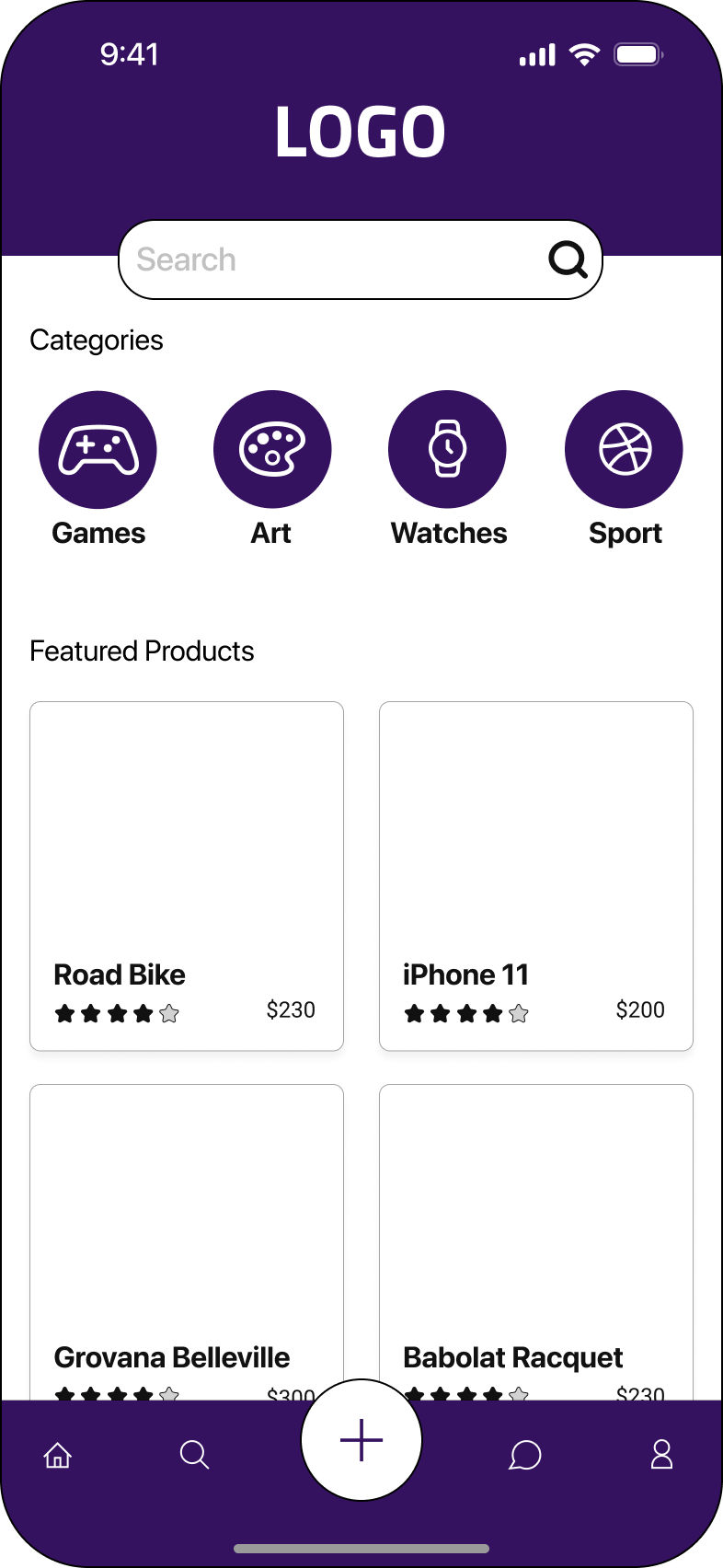
I wanted to ensure the UI maintained a visual identity that aligned with current design standards, balanced aesthetics, and functionality. Iteration 2 was initially chosen as the design we were moving forward with. I thought it was our best option. It showcased everything we wanted on this screen including logo, search, filter, actionable categories, distance dropdown, and the full display of 6 products (image + title + price) without the need to scroll. Ultimately iteration 3 was chosen for the Hi-Fi due to its larger surface area for image/product display and categories as well as the ability to edit distance was a feature added to the filter icon.

Validation
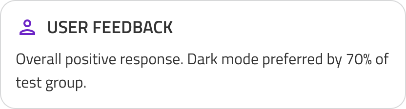
I developed light and dark mode prototypes and conducted A/B testing against the existing experience.
Accessibility & Visual Design
A color palette was chosen that represented what the brand stood for: Luxury, Royalty, Sophistication, “High-value.” To enhance visibility and stay consistent with WCAG regulations we chose a color palette that was mostly variations of black or white (depending on mode) for negative space with subtle hints of the brand purple.

Readdressing Goal Statement
1.
How might we successfully reduce user friction and cognitive load during onboarding?
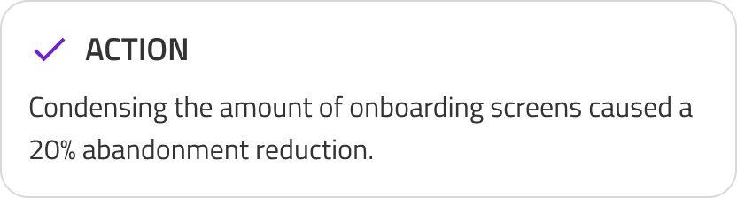
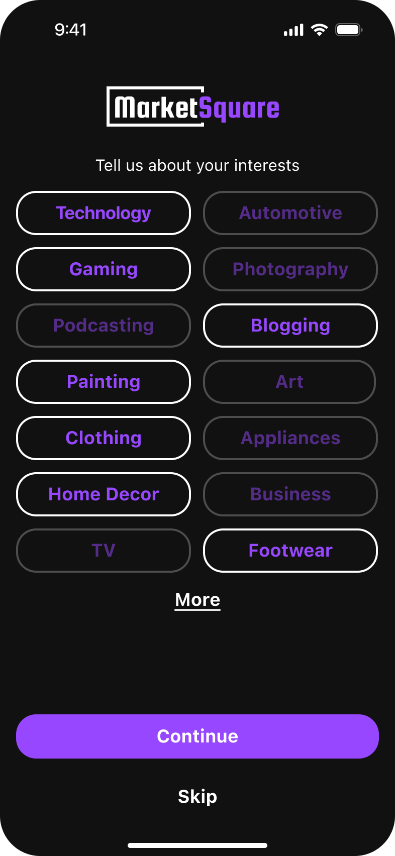
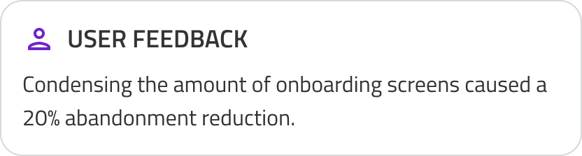
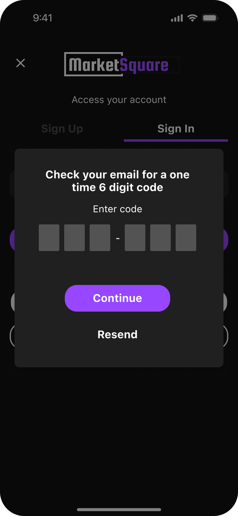
Previously during onboarding each individual interest category had it’s own screen with a description of the topic and there was no way to skip through. This meant users had to cycle through 10+ frames before reaching the homepage.
2.
How might we successfully Introduce AI and determine how it can be used to improve item listing clarity.
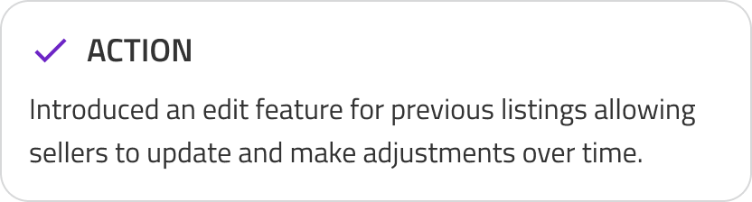
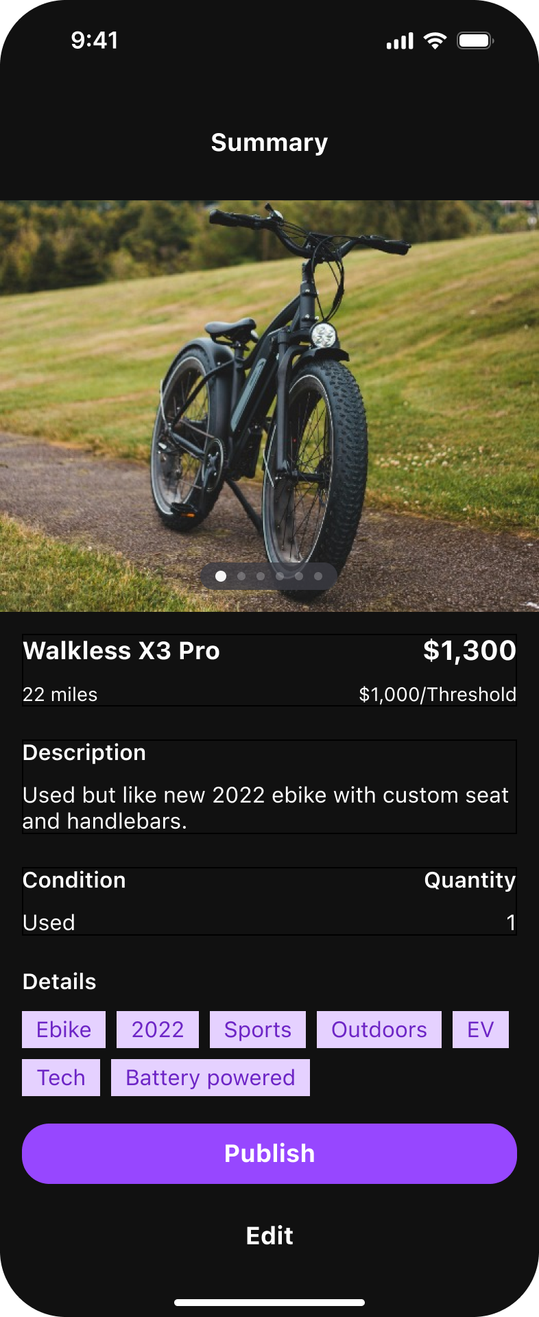
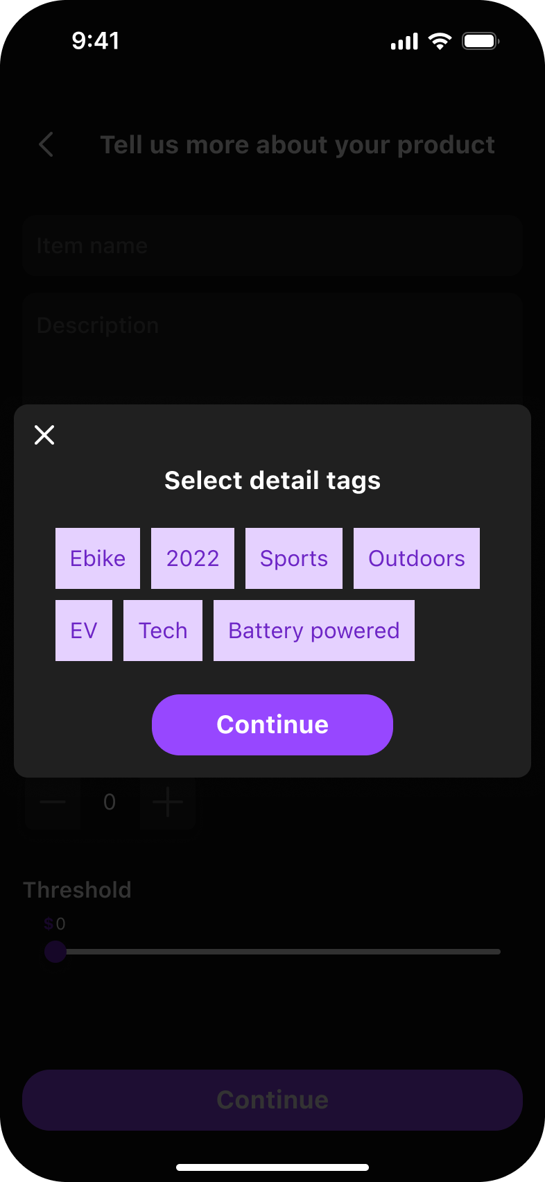
Previously Sellers could not edit an existing entry. That meant no price or description updates.
3.
How might we successfully reduce churn and increase user trust in overall product?
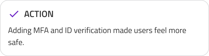
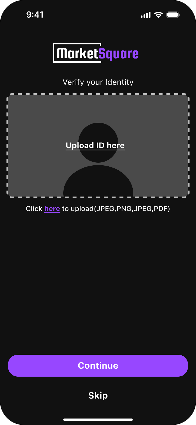
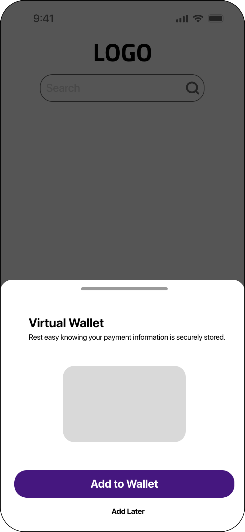
Buyers and sellers alike benefited from the MFA and ID verification. User felt safer with the additional security feature.
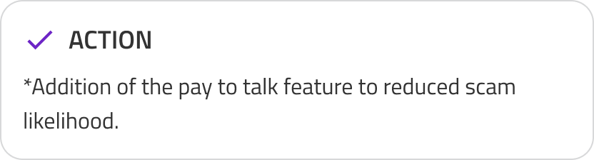
* The addition of the pay to talk feature increased serious inquires for buyers but decreased overall user engagement.
Results
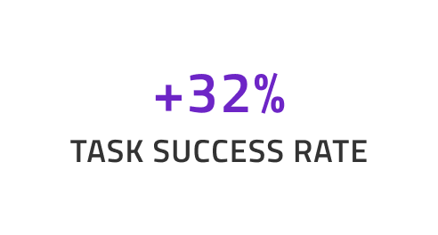
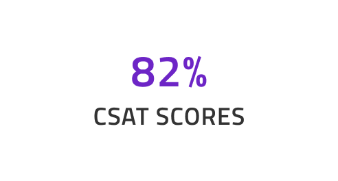
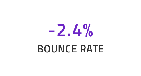
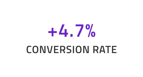
This project enhanced user satisfaction, reduced cognitive load, improved conversion, and set the foundation for scaling AI across the product including the web version.
Takeways
Reflection
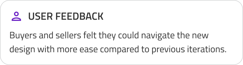
Prioritizing the user is fundamental to effective design. Achieving transparency requires a clear understanding of user needs, while thoughtfully balancing those expectations with business objectives.
What I Learned
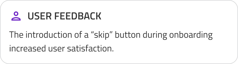
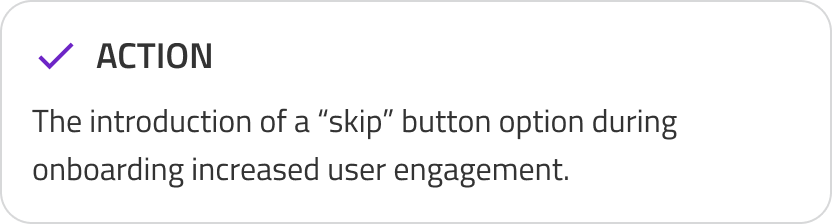
Optimizing for the shortest possible user path improves overall efficiency. By reducing the number of steps required during onboarding and incorporating a skip option, user satisfaction was significantly enhanced.
What I Would Do Next?
Al implementation for web. Adapting the same updates form this project and translating them across platforms. Some suggestion that come to mind would be the addition of MFA password protection for the wallet flow.